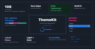
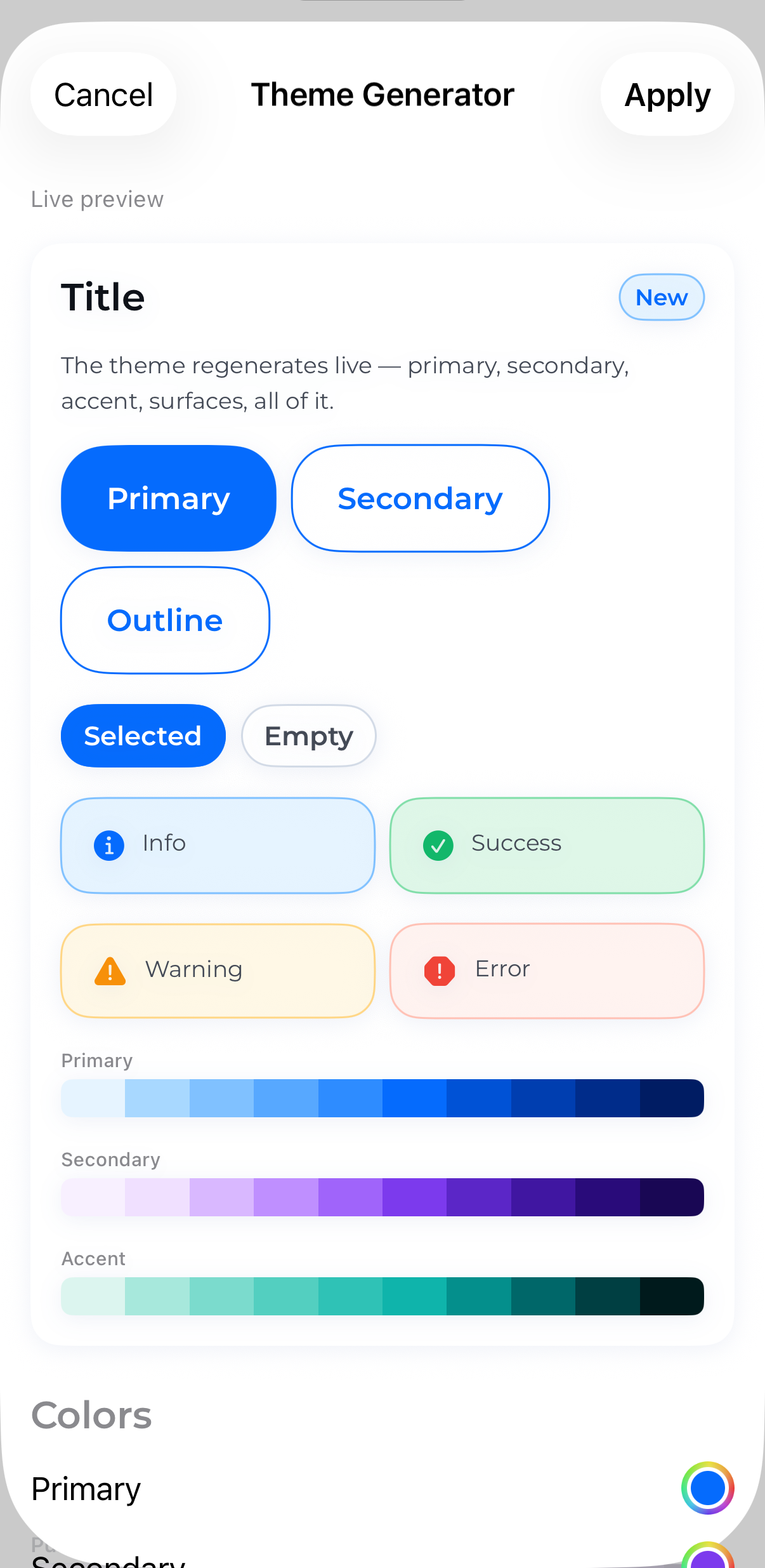
Design tokens
Color, spacing, radius, and typography flow from a single theme. Restyle the whole library by swapping one token set.
Created & maintained by @isamercan
Design tokens
Color, spacing, radius, and typography flow from a single theme. Restyle the whole library by swapping one token set.
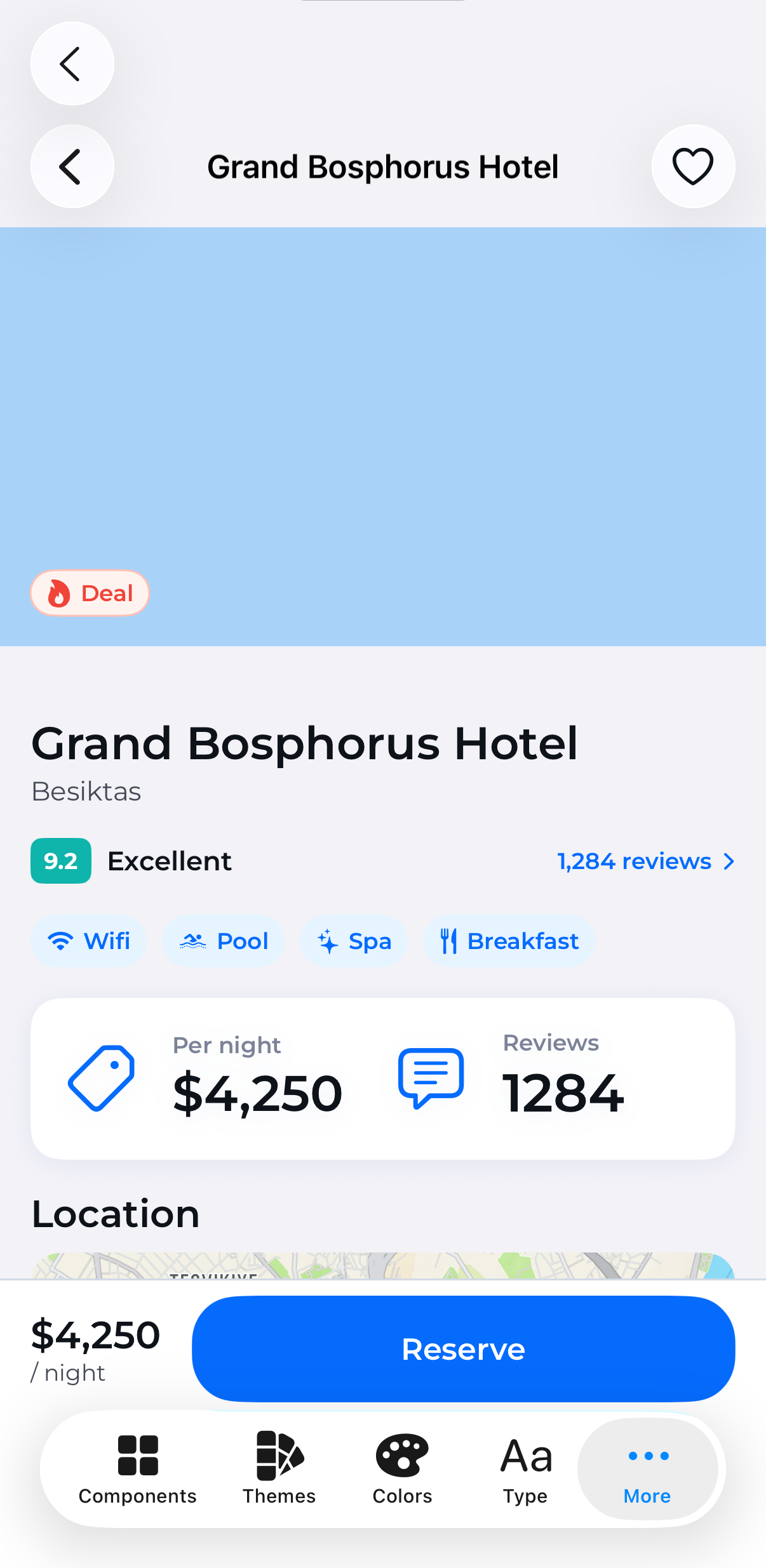
Accessible by default
Dynamic Type, VoiceOver labels, and contrast baked in — not bolted on.
Light, dark & RTL
Every component ships light/dark variants and mirrors correctly for right-to-left layouts.
Swift Package
Drop-in via SwiftPM. Browse the full API in the DocC reference.
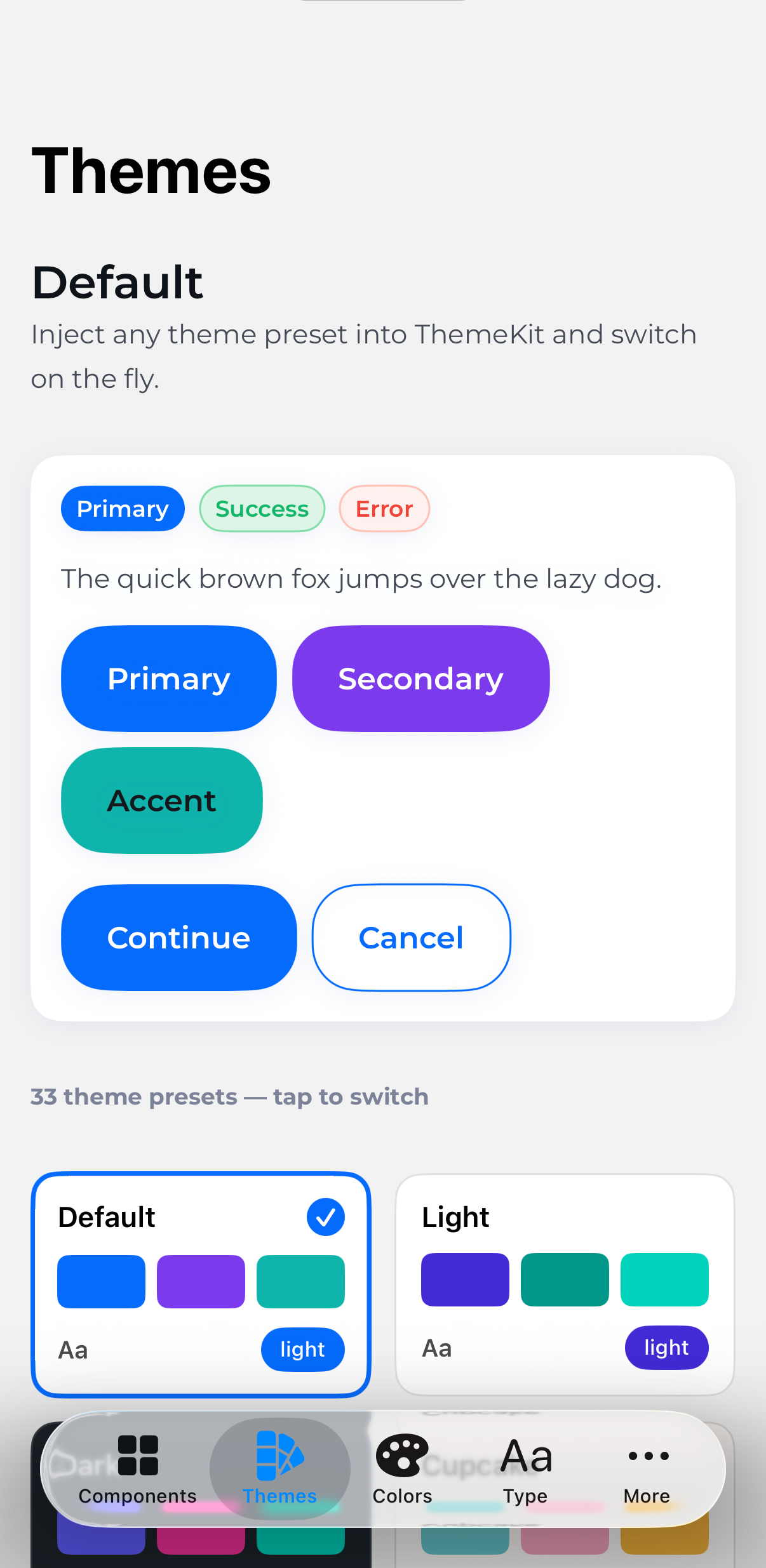
The same components, re-skinned by swapping a single theme. Cupcake stays cream, dracula slate, cyberpunk yellow — brand color follows the theme while semantic colors stay consistent.
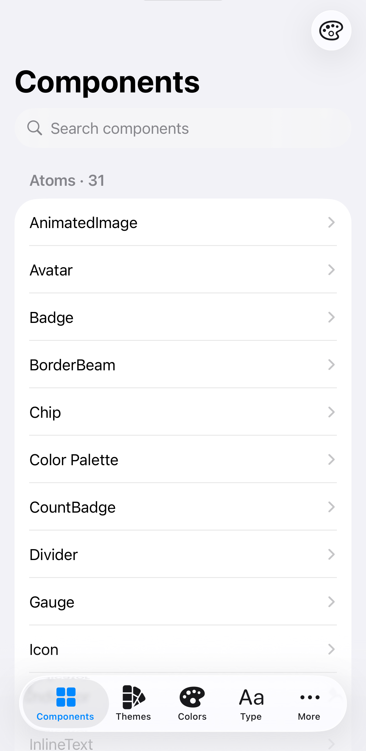
Browse all 95 components in the gallery, or jump straight to Getting Started.