Component Gallery
Every tile below is rendered by ThemeKit itself — the same token pipeline that paints your app. Toggle the site theme (top right) and the gallery follows: each component shows its light or dark variant.
For the full API of any component, see the DocC reference.
95 components
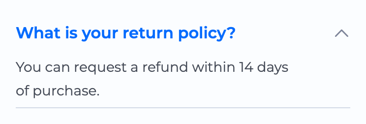 Accordion
  AlertToast GIF
 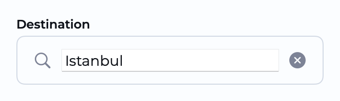 Autocomplete
 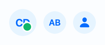 Avatar
  Badge
Badge  BorderBeam
  Breadcrumbs
 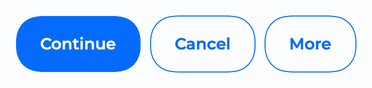 Button
 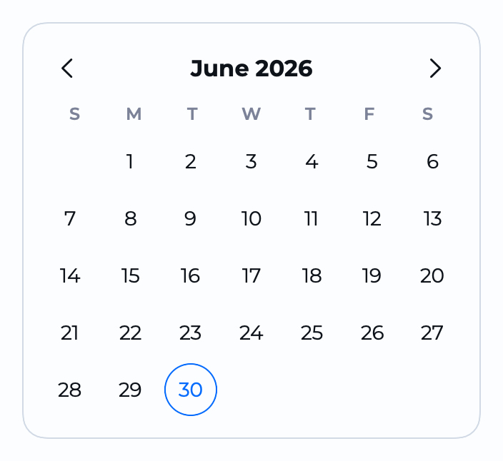 Calendar
 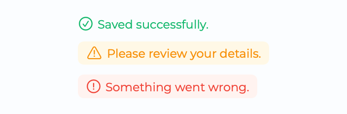 Callout
 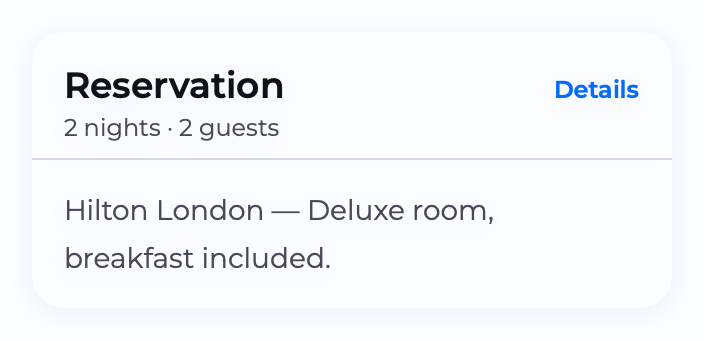 Card
Card  CardStack
 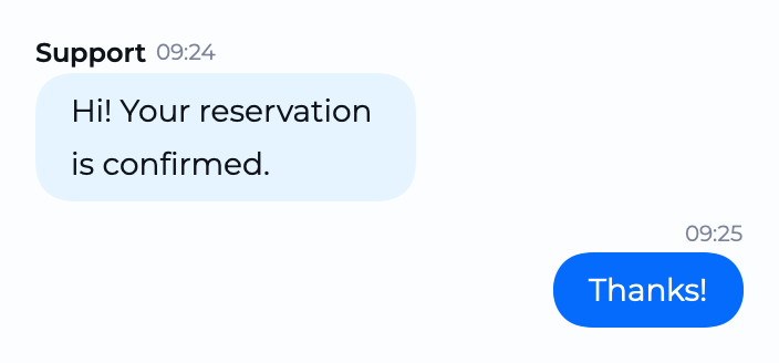 ChatBubble
 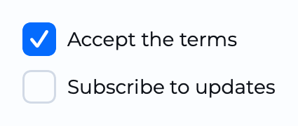 Checkbox
 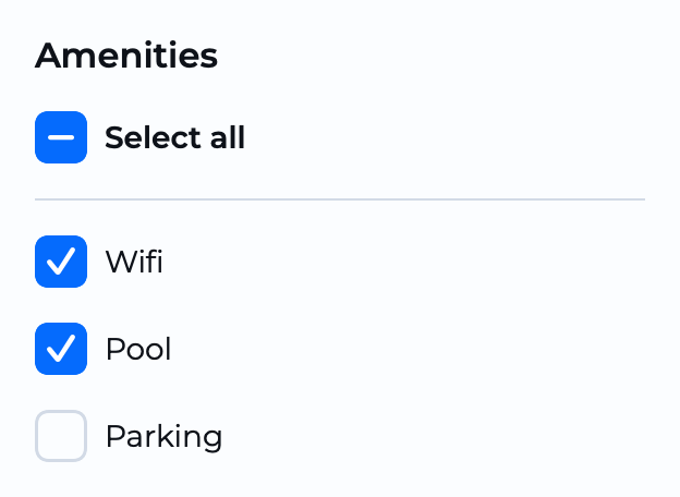 CheckboxGroup
  Chip
Chip  Chips
Chips 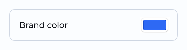 ColorField
  CountBadge
 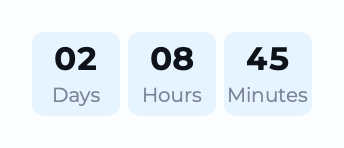 Counter
  Coupon
 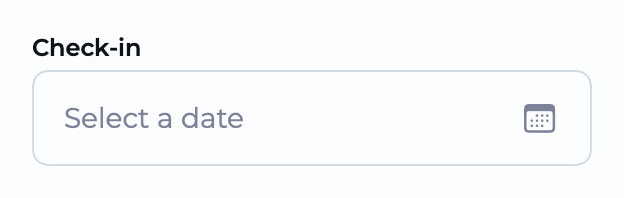 DateField
 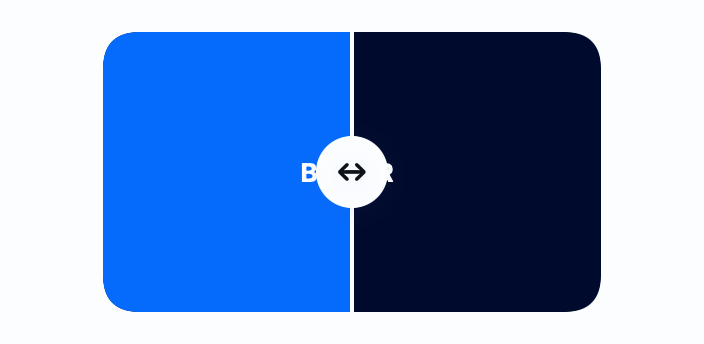 Diff
Diff  Divider
 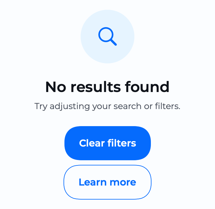 EmptyState
  FAB
FAB 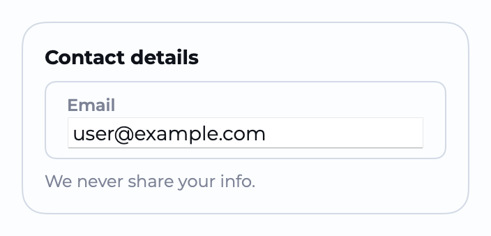 Fieldset
 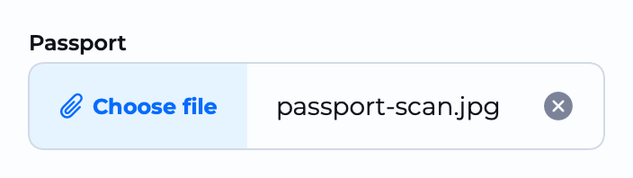 FileInput
  FilterGroup
 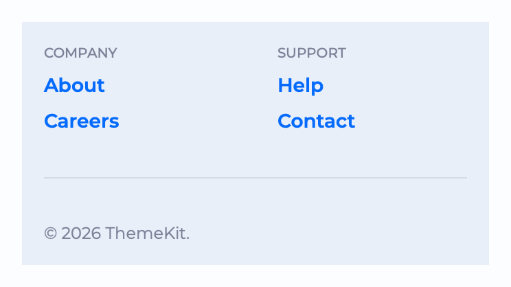 Footer
 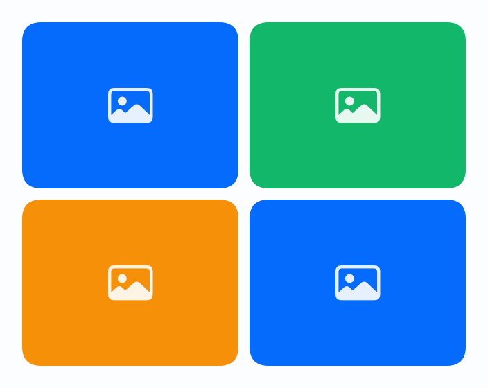 Gallery
 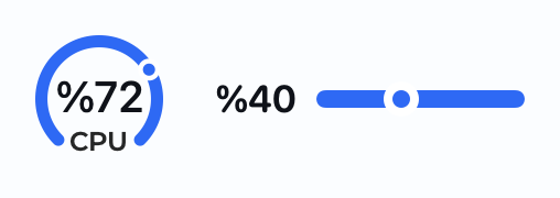 Gauge
Gauge  Hero
Hero  Icon
Icon  Indicator
 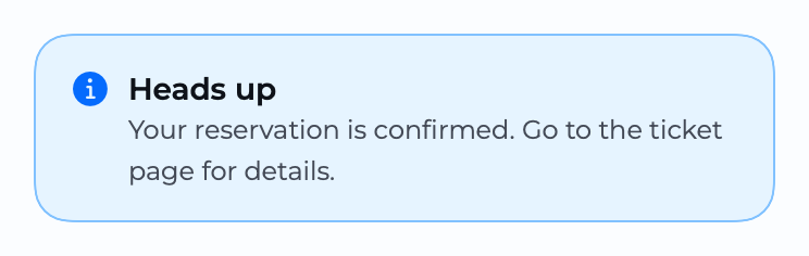 InfoBanner
  InlineText
  InputLabel
 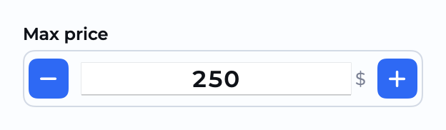 InputNumber
 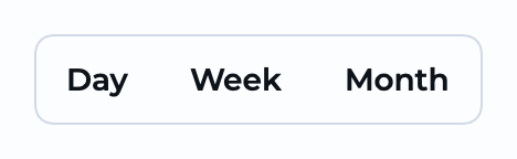 Join
Join 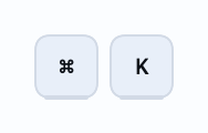 Kbd
Kbd 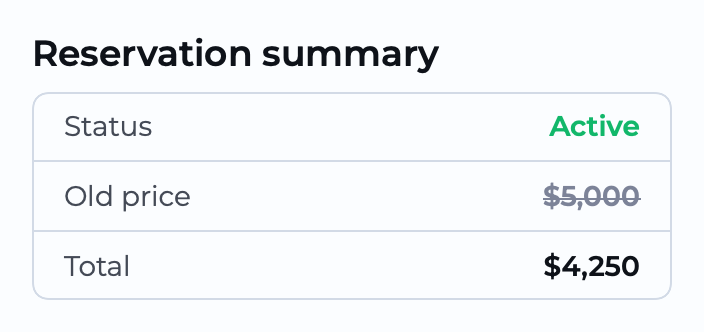 KeyValueTable
 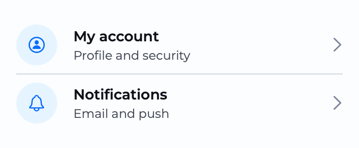 ListRow
 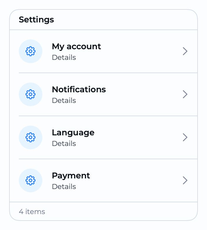 ListView
  Mask
Mask 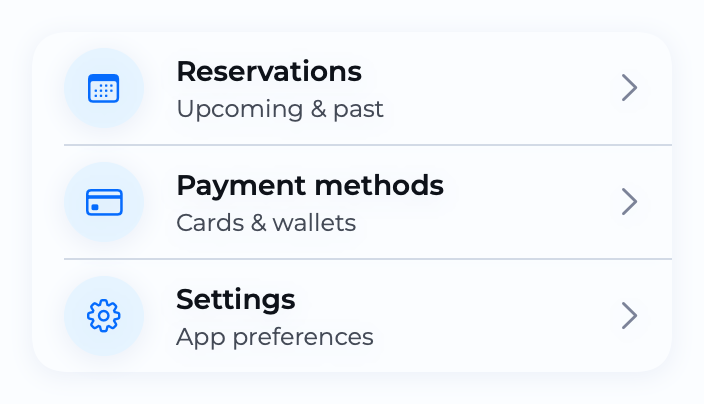 MenuCard
 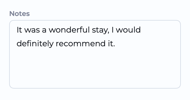 MultiLineTextInput
 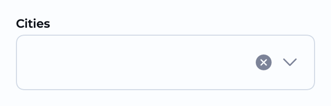 MultiSelect
  NavigationBar
 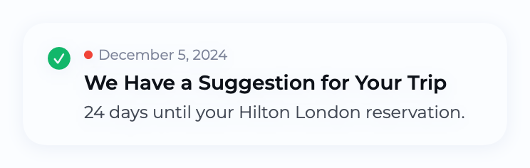 NotificationCard
 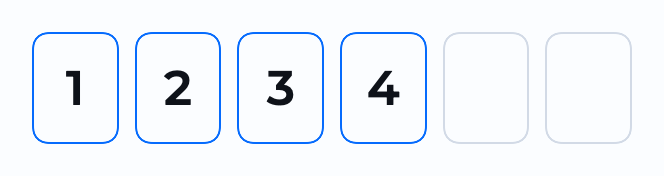 OTPInput
  PageHeader
 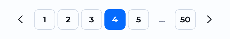 Pagination
 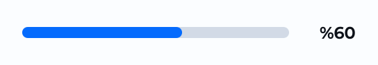 ProgressBar
  ProgressIndicator
  PromoBanner
 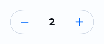 QuantityStepper
 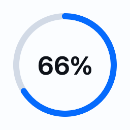 RadialProgress
  RadioButton
 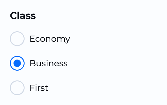 RadioGroup
 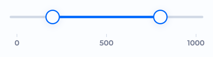 RangeSlider
  Rating
  RatingSummary
 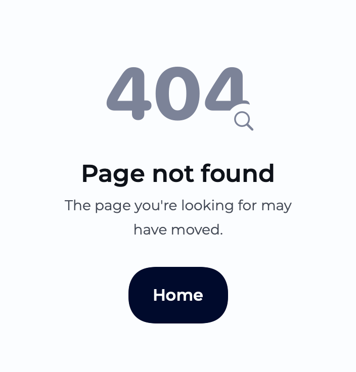 ResultView
 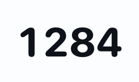 RollingNumber
  ScoreBadge
 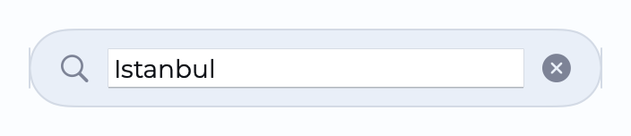 SearchBar
  SegmentedControl
  SegmentedTabBar
 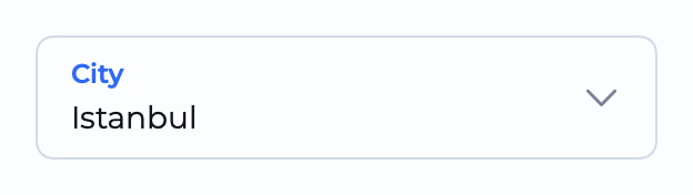 Select
 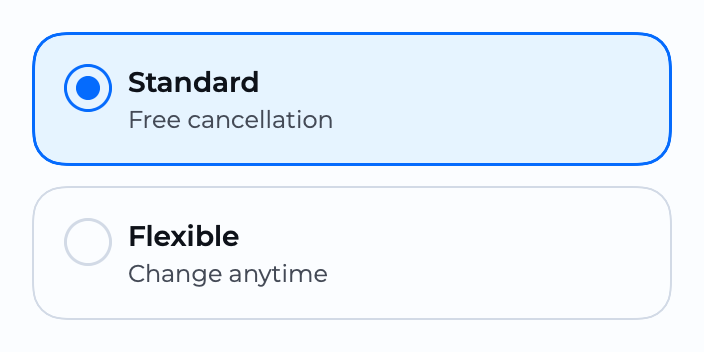 SelectionCards
 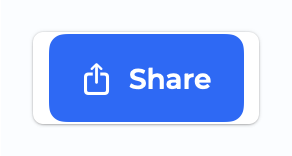 ShareButton
  Skeleton
 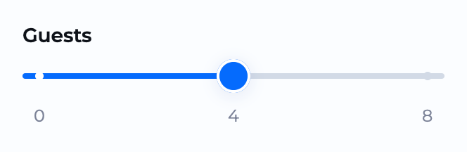 Slider
  Spinner
 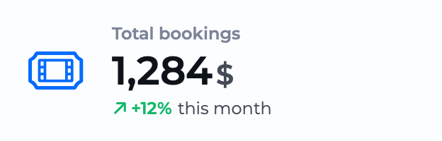 Stat
Stat  StatusDot
 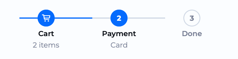 Steps
Steps  Swap
Swap  Tag
Tag 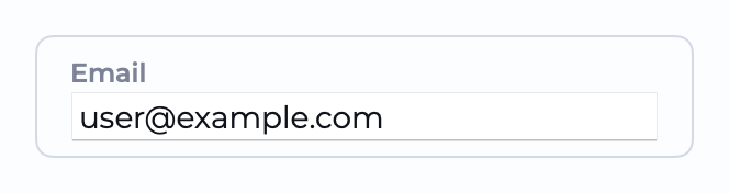 TextInput
  TextLink
  TextRotate
 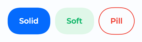 ThemeButton
 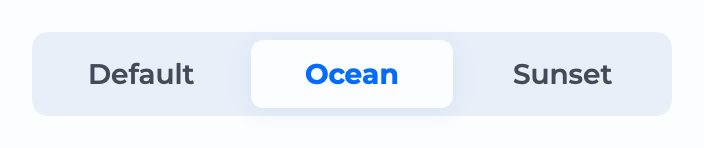 ThemeController
 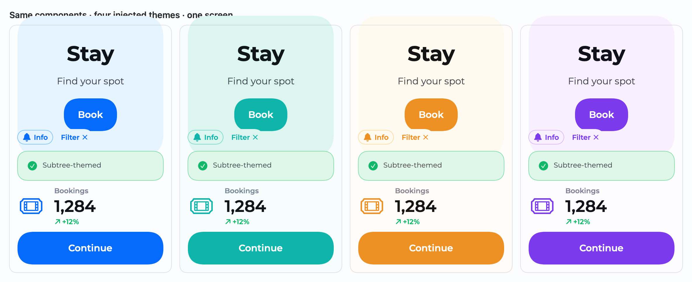 ThemeInjection
 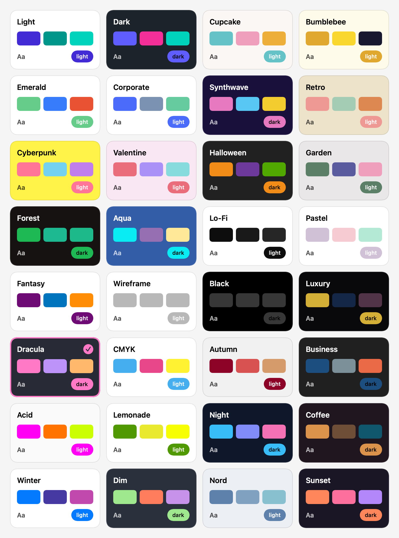 ThemePresets
 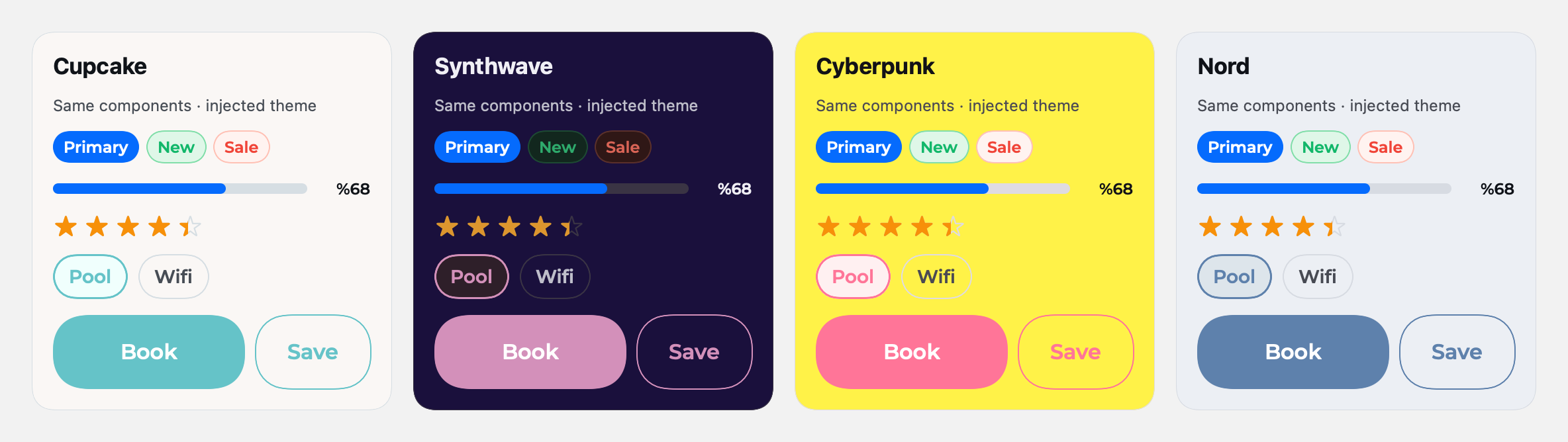 ThemeShowcase
  ThemeToggle
 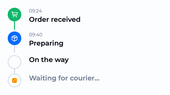 Timeline
  Title
Title  ToggleGroup
  Tooltip GIF
 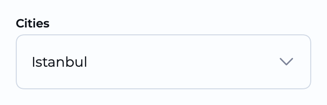 TreeSelect
 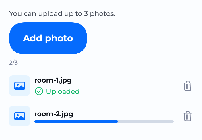 Upload