Theming
A Theme is a full set of design tokens — colors, type, spacing, radius, shadow.
Every ThemeKit component reads tokens from the active theme via
@Environment(\.theme), so re-skinning is a single assignment.
Theme presets
Section titled “Theme presets”ThemeKit ships 33 ready-made presets: its Default plus 32 color sets inspired by daisyUI (cupcake, dracula, cyberpunk, synthwave, nord, coffee…). Each preset’s accent recolors the whole Ant-style palette while keeping its signature surface tone.
ThemePreset.named("dracula")?.apply()        // recolors Theme.shared on the fly
@State private var active: String? = "cupcake"ThemePicker(selection: $active)              // a tappable grid of all 33 themes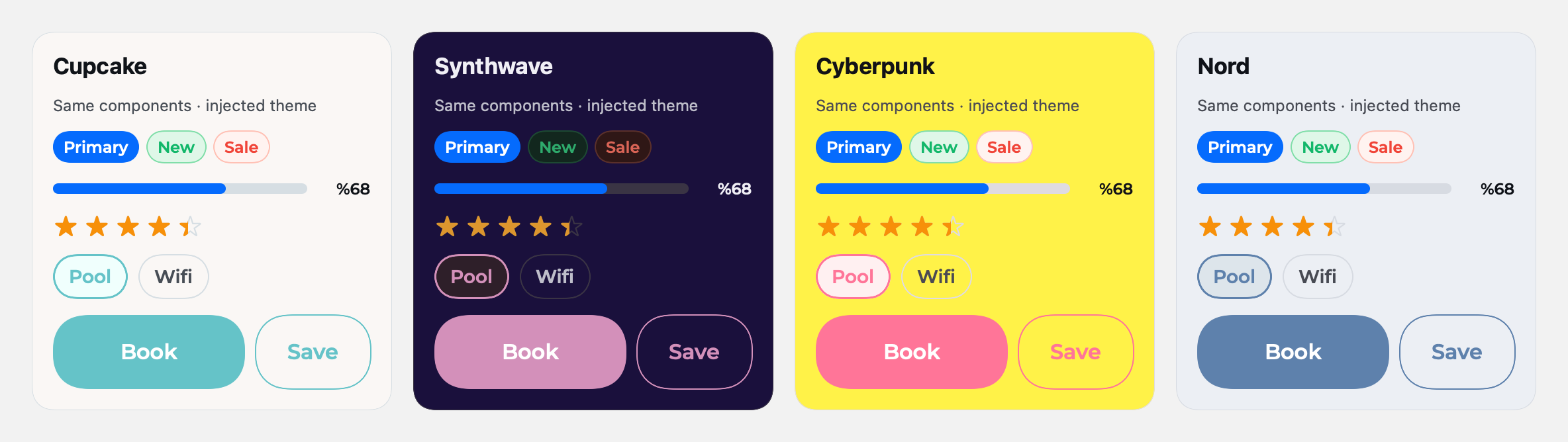
Generate a theme from one color
Section titled “Generate a theme from one color”Don’t have a design system? Generate a full palette on-device from a single accent hex — ThemeKit derives the Ant-style scale for you.
let theme = Theme()theme.applyGenerated(primaryHex: "#7C3AED") // full palette from one accentPer-subtree theming
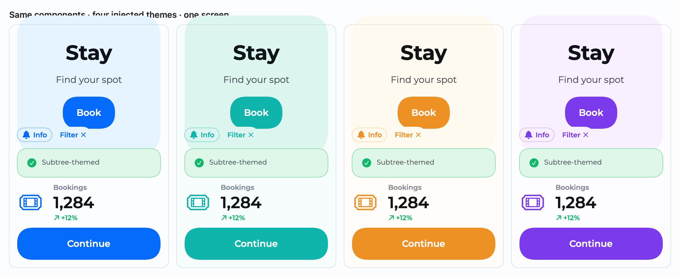
Section titled “Per-subtree theming”Theming isn’t only a global switch. Inject any Theme into a single subtree with
.theme(_:), and every component inside re-skins to it — no Theme.shared
mutation, no global state. The rest of the app keeps its theme.
let ocean = Theme(); ocean.loadTheme(named: "oceanTheme")let grape = Theme(); grape.applyGenerated(primaryHex: "#7C3AED")
HStack {    BookingCard(...)                 // app theme    BookingCard(...).theme(ocean)    // ocean — this subtree only    BookingCard(...).theme(grape)    // grape — this subtree only}
Brand colors follow the injected theme while semantic colors (info, success…)
stay consistent. Because every component defaults to Theme.shared, this is
fully additive and backward-compatible.